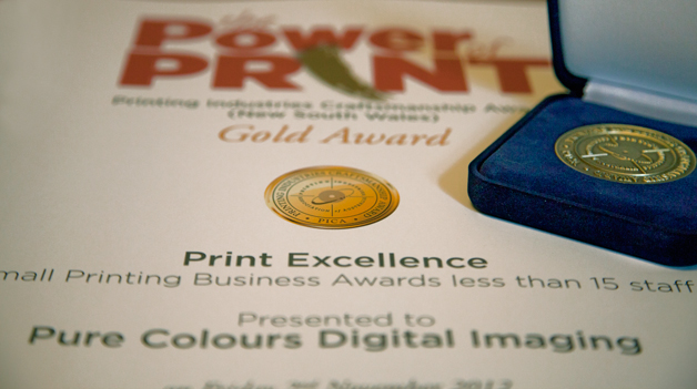
It always brings on the warm and fuzzy feelings when your efforts are recognised, especially by your peers – and most especially when times are still tough.
The occasion was “The Power of Print” – the 2012 NSW PICA AWARDS Dinner, held at the Parkside Ballroom in the Sydney Convention and Exhibition Centre, Darling Harbour.
The award was presented in front of some 500 representatives from a huge range of companies in the NSW printing industry.
The Gold Medal was won in the category of “Small Printing Business with less than 15 Staff” and recognised the overall standard of excellence and the group effort required to produce the printed piece.The winning item was a case-bound, A3-sized book for The Institute of WOW, entitled “The WOW Manifesto”. WOW by name and WOW by design, as well.
A great many people were involved in all stages of production of the winning book.
The author, John Dwyer, has brought together in this 212 page volume an enormous repository of advice, information and experience about marketing, collected over his many years of advising small, medium and large businesses.
The designer, Gregg Carson, spent an incredible amount of time and effort to bring John Dwyer’s vision of “WOW” to reality, using specially created graphics and customised images, as well as a huge number of photos and illustrations.
 Andrew Hingeley, of Kainos Print, laboured for days to ensure that the final artwork was complete before handing over to John Maclulich, of Colours, who created the design for all the embellishment and co-ordinated the printing, finishing and binding.
The cover was printed offset, by Megacolour, on 170gsm Sovereign Gloss from K.W. Doggetts. It was then celloglazed with Allkotes Silk Touch Matte, and varnished by Allkotes Pty Ltd with spot gloss UV – not just once, but twice – with an extra coat of high-build varnish, in a leather-grain pattern. Goldcraft Embossing Pty Ltd then applied the finishing touch, by embossing the large emblem and some of the type on the front cover.

The text pages were printed by Colours on 170gsm Pacesetter Satin from Spicers Paper.
Full-colour throughout, multiple copies of the 212-page text blocks were printed on a Konica-Minolta C8000 Bizhub Press in just under 4 hours, colour-matched to ISO standard proofs.
The text blocks were then case-bound by Les Baddock Book Binders, with extra-tactile foam-board covers, marker ribbons and brass corners.
Fifty copies of the final product were individually wrapped and packed, then shipped to the customer in time for a launch at a 3-day conference for small-business owners.
Even More WOW! – beneath the surface
As “WOW” as the A3 book appears to be – both in subject matter and in presentation – what is not immediately obvious when you look at the finished job, is that there is an even deeper level of “WOW” built in.
The book makes extensive use of Augmented Reality and QR codes, throughout.
By pointing a smartphone or tablet camera at the front cover and selected internal pages, it is possible to view additional interactive material – videos, pdf files and images – as well as link directly to the customer’s web-site. Images and QR codes in the body of the text also can take the reader to pages on The Institute of WOW’s web-site.
All of this adds even more to the overall WOW experience. Our thanks go to all those who contributed to every component of this project. All of us at Colours acknowledge that the gold medal achievement truly was a group effort.


